VISCOVER is now featured in the RStudio Shiny Gallery!
From beginner to developer - how I progress with R Shiny
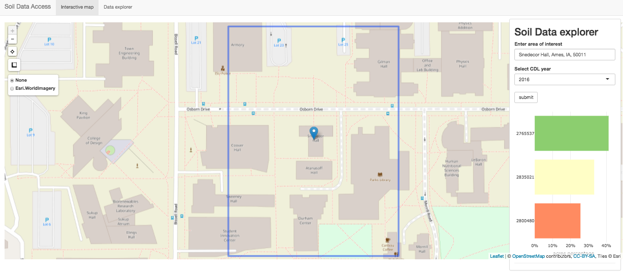
I am so happy to share the news that my R Shiny app viscover is now featured in the RStudio Shiny Gallery. 🎉 🎉 🎉 It's categorized into the Public Sector section in the Gallery due to its application to the soil survey data and cropland data layer maintained by the USDA. viscover takes its name from VIsulizing Soil and Crop data and their OVERlay. Although my motivation to develop this app is to communicate how we integrate the two data sources for defining auxiliary variables for our small area estimation model. It can be fun to locate yourself using the app (https://lyux.shinyapps.io/viscover/) and let viscover tell you what crops1 are around you! Believe it or not, It helps me satisfy my mom's curiosity when we were having a road trip in California and passing by a large orchard containing all types of fruit trees. 🍓 🍑 🍈 🍒 🍇 🍎 🍉 And unsurprisingly, I find myself surrounded by large fields of corns and soybeans now in Ames, Iowa. 🌽 🌽 🌽 🌽 🌽 🌽 🌽 Below is a short video showing what viscover can do.
How I promote “viscover” to RStudio Gallery
Back when RStudio held the first R Shiny contest2 in the spring of 2019, I gave it a try and submitted my work viscover. Although I lost the contest, I received recognition from the RStudio and got invited to join the user showcase! 😆 And on the first day of the RStudio conference 2020 in this January, RStudio published an updated look of the R Shiny gallery and viscover is now out there. It's a tremendous encouragement to me and makes me so proud of myself! 💃
How I learned R Shiny
It's in one of the graphics group meetings in the spring semester of 2016 at Iowa State University (ISU) that I learned R Shiny for the first time. Eric Hare3 gave a great presentation introducing R Shiny. And he said some very appealing words as I quoted here.
Shiny is a web development framework for turning an R analysis into an interactive website without any knowledge of HTML, Javascript, or CSS. Shiny apps are simple to write, but also can be incredibly capable. For those of you who haven’t used Shiny before, I highly recommend you check it out, as it opens up a whole world of possibilities for sharing an R analysis.
I learned some basics about R Shiny in that graphics group meeting. Afterwards, I read and watched all the Shiny tutorials by RStudio to familiarize myself with some advanced functionality of Shiny. Practices made perfect. I've been improving my R Shiny skills through a few hands-on experiences.
How I got the chance to develop Shiny tools
The following sections are a few short stories about my experiences in developing Shiny tools. If you're not interested, you can jump to the last section to check my recommendations for learning and mastering Shiny. 🚩
Iowa DNR MSIM - SGCN Modeling
My first project as a graduate research assistant at the Center of Survey Statistics and Methodology (CSSM) at ISU is to predict the probabilities of occupancy, colonization and extinction for wild species of great conservation need in Iowa. We are supposed to deliver the final data products (three prediction maps in GeoTIFF format per species, 69 species in total) to the Iowa Department of Natural Resources (IDNR). It occurred to me that an interactive web tool presenting the prediction maps might be helpful for visualizing the results and allow land managers to access the predictions anywhere and anytime with a web browser instead of opening a GeoTIFF file in ArcGIS. I told my collaborator Tyler Harms the idea and showed him my preliminary development of the tool. He was very excited about the tool and finally we got approval from our boss to spend more time improving the tool. We demonstrated a beta version of the tool to the IDNR people and they were also impressed. I felt greatly grateful to Tyler and Steve who supported my Shiny idea and the CSSM IT team who helped me host the Shiny tool online with a professional internal Shiny server.
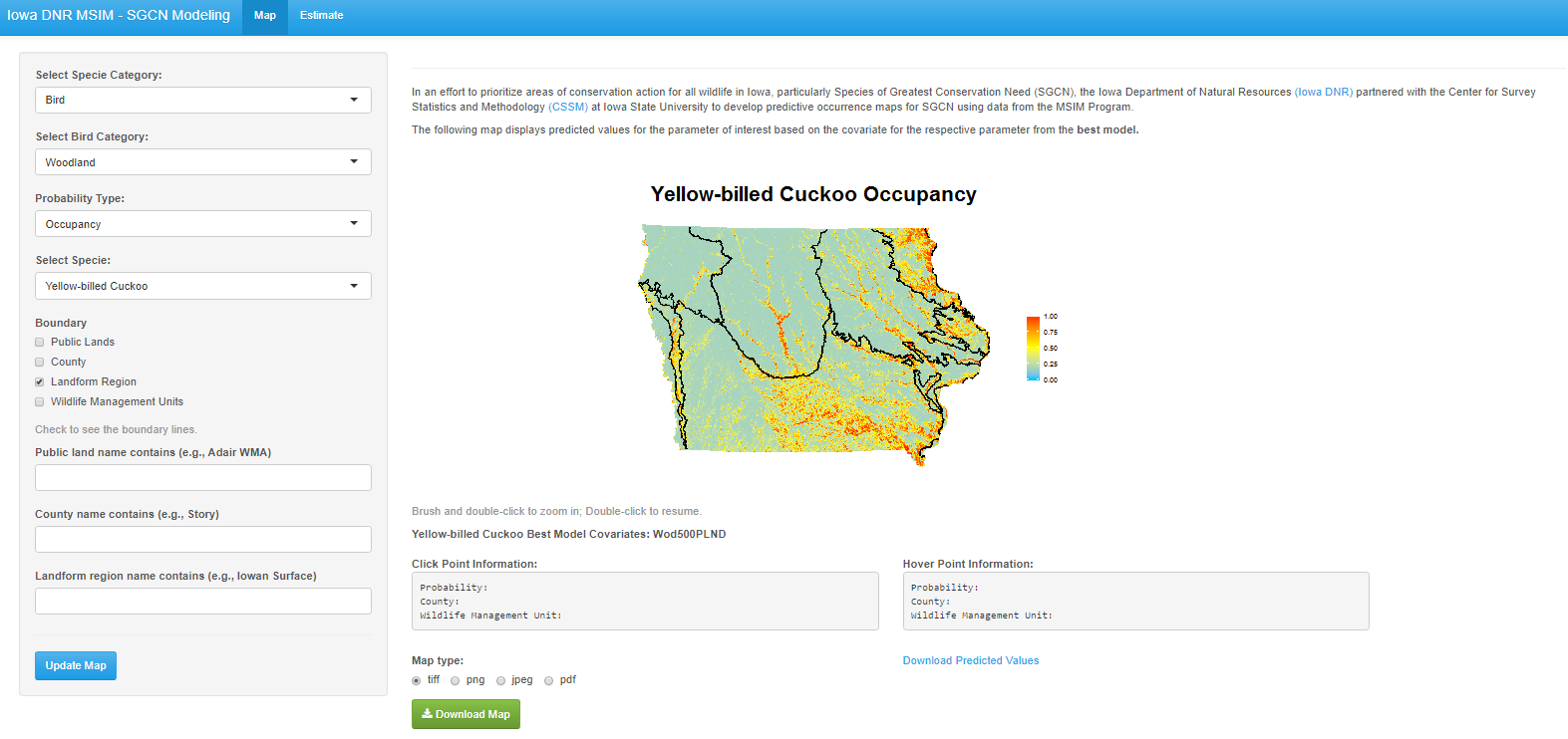
From the screenshot of the app, you might be able to tell that the map is made with ggplot2. This app was developed in 2016. Not knowing any fancy R packages for making interactive plot at that time, I programmed the interactivity by linking click and hover event with textOutput using base R functions. The app looks somewhat primitive today but gave me a lot fun and got me started in developing Shiny tools for CSSM. 🐾
Communicating statistical models
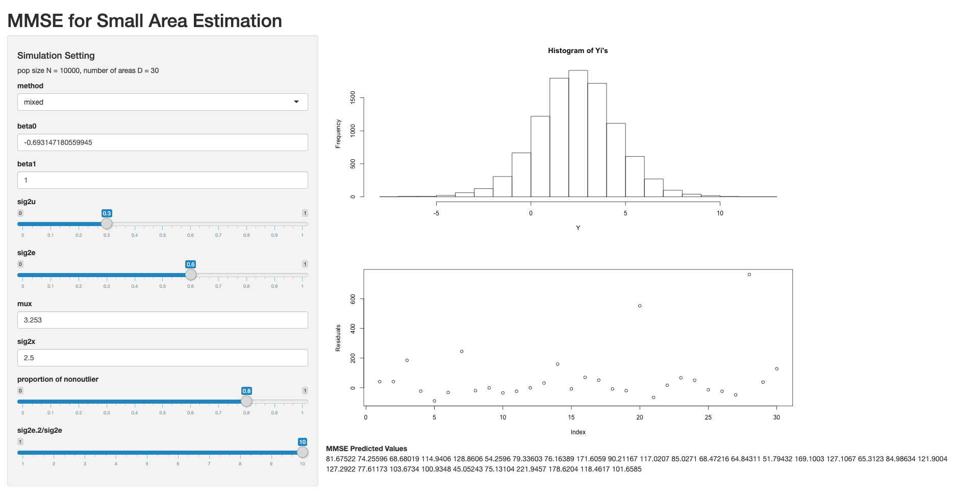
After finishing the project for IDNR, I was into developing Shiny tools for some statistical models. Below is an example Shiny app I developed and showed to my advisor Dr.Emily. We were working on an extension of a lognormal model in small area estimation where the errors are a mixture of two normal distributions with different variances. This tool is designed to show how the parameters affect the shape of the distribution and the residuals from fitting the data with a minimum mean square error (MMSE) predictor assuming homogeneous errors. Such tool is developed to be used internally for the purpose of model diagnosis. That's why it's designed with a pretty simple user interface. 😅
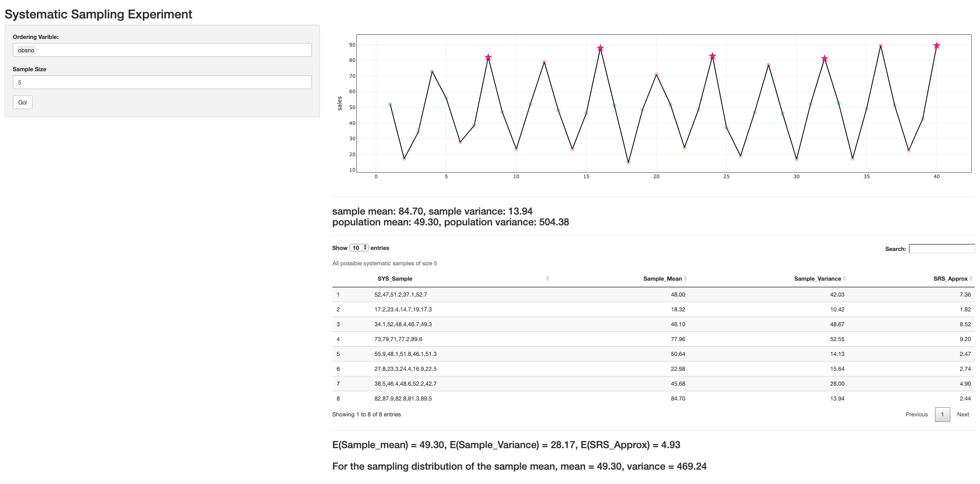
I was a lab instructor for STAT421 for one semester when many students in the class were confused by how the ordering of the sampling frame affects the sampling distribution of a systematic sample. Therefore, I developed this scratchy Shiny app to help them learn the idea through instant experiments. Well, at least it helps me explain the concept much more clearly. 😂
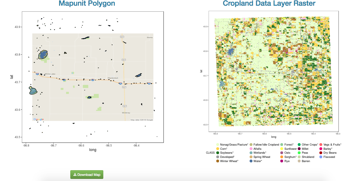
Before the final version of viscover, I have developed a few beta versions. The above one mostly uses ggplot and ggmap. Due to the large file size of the soil map unit polygon file and the CDL raster file, this version of viscover is very slow even when only a small scale (2 counties) of the soil and cropland data are loaded into R. The current version uses the Web Map Service with leaflet and is much light-bodied and highly responsive. The below one is a second version I tried after presenting the first version in the graphics group meeting and Sam Tyner suggested me trying leaflet for a better interactive visualization of spatial data. Big thanks to Sam for the great advice! The UI design of the second version of viscover is learnt from the SuperZIP example in the Shiny gallery. I turned to shinydashboard finally for designing the UI due to that viscover includes table and plot outputs in addition to the interactive map. And shinydashboard can help design a much more clear layout.
ISOFAST (ISA On-Farm Trial Summarization Tool)
I started collaborating with Anabelle on developing ISOFAST in October 2017. Above is a nice Youtube tutorial of ISOFAST made by Suzanne from the Iowa Soybean Association. Anabelle and her co-authors published the framework of their data analysis on Agronomy Journal. 📖 I took over the Shiny development at an early stage of the project. I was glad Anabelle and Peter agreed my proposal of making every plot in the tool interactive with the R package plotly. And I helped them (1) re-design some of the complex visuals such as the forest plot for the Bayesian analysis; (2) fulfill some particular requests such as data cleaning, larger fonts, uniform color scheme 🎨 for coding years across plots, certain axis break/label rule, and so on. After all of us agreed on a particular set of visuals for one dataset, I wrote a R file defining the plot theme and another R file containing kind of “template” functions that apply to any other datasets in the same format. Therefore, the tool is quite scalable and easily maintained because visualizations of any new data can be added to the tool by using the template functions. Since I insisted, Anabelle, Peter and Suzanne started using GitHub for version control and collaboration. And they handled the later Shiny development very well. Empowering people to continue maintaining the Shiny tool by their own is actually a greater achievement for me. 😆 Now this tool ISOFAST is put into use by Iowa Soybean Association and we received positive feedback from Iowan farmers, the target user of the tool.
iNtr: an interactive NRI table review tool
The USDA-NRCS in a collaboration with CSSM released the 2015 National Resource Inventory (NRI) estimates in 2018. It is in the summer of 2018 that I developed another Shiny tool iNtr for CSSM. The motivation is to improve the efficiency of the NRI table review given the in-house methodology is too labor-intensive and puts too much cognitive load on the reviewers. The video demo shows an adapted version of the actual tool being used by NRI due to confidentiality of the true NRI data. But the two tools works in the same way in that they allow reviewers to quickly transit from one comparison to another and use color hues to highlight important table cells. As the old saying goes, difficult the first time, easy the second4. 🎯 My collaboration with the CSSM data analysts and the IT team was more and more efficient. It's only a couple of weeks after we started developing the tool that iNtr was deployed and helped CSSM release the 2015 NRI estimates in September, 2018. With a history of nearly 40 years, the NRI database is nicely maintained. Therefore, little data cleaning needs to be done. It did take me a while to design a different data structure such that a “template” plot function could be used for any selected table. It turns out the NRI data analysts are quite satisfied with iNtr. Steve said iNtr is one of the biggest innovations of the 2015 NRI! And now iNtr is being used to help the table review of the 2017 NRI which is expected to be released in 2020.
Some Shiny tips
Okay, so far I have finished my personal stories with R Shiny. As Aristotle said,
For the things we have to learn before we can do them, we learn by doing them.
To sum up, I find myself the chances to develop Shiny tools through either helping with daily research/teaching or a formal project/job offer aiming for delivering a working web tool. The former situation is more relaxing and less demanding, while the later one makes you comfortable spending more time investigating and experimenting new Shiny features because you will always get some unexpected requests from the “client”.
For suggestions, I often check the Shiny Gallery to see what features are useful and learn from the source code. The following are some great resources for learning and working with R Shiny based on my own experience.
-
R packages for designing user interface: shinydashboard, shinyWidgets, shinycssloader, bootstraplib
-
R packages for making interactive plots/maps/tables: plotly, leaflet, leaflet.extras, DT
-
Resources for dashboard design: Stephew Few, Hadley's tweet
Any recommendations for books about creating effective dashboards?
— Hadley Wickham (@hadleywickham) May 29, 2019
-
Icon libraries: fontawesome
For developing customer-facing Shiny tools such as ISOFAST and iNtr, I have followed several guidelines6:
-
Talk with the end-users first and get to know their expectation.
-
Get to know the data, clean the data if necessary. A tidy and consistent data structure is half way to a successful Shiny tool.
-
If the same copy of visual component is reproduced multiple times in the app for different datasets, it's advised to write a template plot function. This will not only improve your efficiency, but also make batch modification to the plots much easier.
-
If the tool contains tons of information, a hierarchical table of content made with the
sidebarMenufunction in the packageshinydashboardcan be extremely helpful. -
Give the tool a demo and a test run, then collect feedback from the end-users and work on improving the details.
-
If there are particular requirements for the plot theme (label, title, axis, digits, color scheme, …) and the theme applies to many plots in the app, define global variables or functions for such themes. Below is some example code for using the same font for axis in plotly output.
## plotly text font
f.tick <- list(
  size = 12,
  family = "Times New Roman"
)
f.axis <- list(
  size = 16,
  family = "Times New Roman"
)
p %>% layout(
  xaxis = list(title = "x-axis title",
               tickfont = f.tick, titlefont = f.axis),
  yaxis = list(title = "y-axis title",
               tickfont = f.tick, titlefont = f.axis))
Ending
Generally speaking, I like using R for writing HTML files/documents such as xaringan for making HTML slides and blogdown for developing website. Huge thanks to Yihui, the author of those wonderful R packages. Shiny is definitely one of the most powerful R tools and helps me communicate statistical ideas or deliver my development in statistical models or methodologies to non-technical people.
Finally, thank you for spending time reading this post. Have a nice day! ❤
-
The cropland data layer is produced by the USDA-NRCS using moderate resolution satellite images and extensive validation. It's only available for the continuous United States at this moment and may subject to prediction error. ↩︎
-
The second Shiny contest by RStudio is now open for submission. You can check the RStudio community for more information. ↩︎
-
Eric is one of my favorite speakers. His presentations are always entertaining and informative. ↩︎
-
一回生二回熟 in Chinese ↩︎
-
I used customized CSS to increase the font size in ISOFAST. And I used HTML tables for the customized tooltip in viscover. ↩︎
-
Some of the principles are also applicable to dashboard development using commercial software such as Tableau and Power BI. ↩︎